
As everyone knows, the sky is blue because it’s a reflection of the ocean, which is also blue. And the ocean, well, it’s a reflection of the sky.
The real reason has something to do with Rayleigh scattering, although as xkcd likes to reiterate, that doesn’t tell the full story either. In the next couple of posts I’d like to explore the different phenomena at play. In this first post I’m going to start by trying to understand the interplay between perception, physics and computer graphics in perceiving and displaying colours. The goal will be to develop a translation from a power spectrum to the equivalent colour in RGB space.
In the next post we can then focus on how to derive the power spectrum of the sky. To give you a sneak peek we’ll need to look at black-body radiation, scattering and some geometry to understand how light from the sun eventually reaches your eyes. But first, we will need to cast our minds back nearly 100 years ago, to the origin of how colours are displayed today.
The standard observer
In the late 1920s and early 1930s Wright and Guild independently ran a series of experiments to understand how mixing illumination sources of different wavelengths can be perceptually identical to a different illumination source, despite the two having very different power spectra. This concept is known as metamerism, and the two power spectra are known as metamers if they look the same to the human eye. It had been hypothesised at the time that all colours could be produced by mixing three so-called primary colours, and in fact this is something that many people are still taught today. Guild notes, with some degree of sass, that this is not the case:
Maxwell’s results indicate that the spectrum he employed was very impure, particularly in the blue-green part of the spectrum. This gave an entirely fictitious approximation of the spectrum locus to two sides of the colour triangle and led Maxwell to conclude that “. . . all the colours of the spectrum may be compounded of those which lie at the angles of this triangle,” and that there was “strong reason to believe that these are the three primary colours corresponding to those modes of sensation in the organ of vision.” These conclusions have long been known to be quite untenable, there being no spectral colours which are in any sense Primary colours or from which all other colours can be compounded.
Maybe he was just jealous that Maxwell unravelled the beautiful relationship between electric and magnetic fields and was hoping to have his own equations named after him. Anyway, moving on.
The way they quantified metamerism was to set up an experiment as follows:
- A circular disk is placed in front of an observer at a distance such that it subtends a 2˚ angle of the subject’s vision. This is important because colour vision is different in different parts of our retina, owing to the different densities of rods and cones on the retina. More on this later.
- One half of the disk is illuminated with light of a known wavelength, e.g. a particular line from the mercury emission spectrum.
- The other half is illuminated by a mix of three illumination sources. In Wright’s experiment they were 650 nm (red), 530 nm (green) and 460 nm (blue).
- The observer varies the intensity of the three primary colours until the two halves match.
The procedure was repeated for different target wavelengths and different observers in order to produce average colour matching functions. Here you can see the results from Wright’s paper:

The keen observer will note that some of the values are negative. It is of course not possible to illuminate something with a negative amount of light. Instead, the experimenters came up with an ingenious method based on the assumption of linearity in light perception.
In 1853 Herman Grassmann proposed a set of laws relating to colour matching. Of interest is the third law:
There are lights with different spectral power distributions but appear identical. First corollary: such identical appearing lights must have identical effects when added to a mixture of light. Second corollary: such identical appearing lights must have identical effects when subtracted (i.e., filtered) from a mixture of light.
When they couldn’t match a target exactly, observers were asked to add light to the target instead. Using Grassmann’s third law (Which is just linearity with extra steps) we can then infer what light we would have had to add to match the original target. We simply subtract the light that was added to the target from both halves of the disk. In this sense we can end up with a negative amount of a primary colour.
In other words, if we cannot match a specific target, we can instead add some amount of, say, red, to it first. If we can match this reddened target that would be equivalent to “subtracting” red to match the original target.
The CIE 1931 colour spaces
By combining the results from the above experiments the International Commission on Illumination (CIE) introduced the CIE 1931 colour spaces. The first of these is the CIE RGB space, which is directly based on the experiments above. They define a so-called tristimulus value of R, G and B corresponding to the amount of each primary colour to add to match a particular power spectrum. Assuming linearity, we can use the colour matching functions obtained for matching a monochromatic target to a whole spectrum P(lambda) as such:


At the time, computation was still done by hand using slide-rulers and pen and paper. Therefore, although the colour matching functions above were perfectly reasonable they were not ideal to do calculations with and the CIE decided to define another colour space, CIE XYZ. The Wikipedia page lists the properties of this space. Most importantly the coordinates are all non-zero for any physically realisable colour. In general the article is a great starting point if you want to go down the rabbit hole of colour theory… For our purposes, suffice it to say that there is a reversible linear transformation between the two, and as a consequence there is also a set of colour matching functions for the XYZ space.
Note that this RGB space is just one of many possible RGB spaces, and the one that’s used by your display is almost certainly not CIE RGB. If you mess around with the display settings on your Mac you can see there are lots of different presets that (not so) subtly change the colours you see on the screen.

A way to visualise how the different RGB colour spaces relate to each other is to project the XYZ space into two dimensions. If you normalise each component by the sum of the three, you can plot x and y (denoted with a lower-case when normalised) in two dimensions. You can ignore z since it’s implied by the other two. In this space the different RGB spaces can be visualised by triangles, with corners where their primaries are. Note that not all points in this space have an associated colour. These are known as imaginary colours and cannot be physically realised. Some RGB spaces use imaginary colours as primaries, which means that not all points in the space can actually be displayed.

With all this in mind the translation from spectrum to colour will be as follows:
- Using the colour matching functions, integrate the power spectrum you want to visualise to generate the coordinate in XYZ space.
- Convert this value to your favourite RGB space
First, we project our power spectrum to an XYZ value using the official colour matching spectra. Then we need to find the linear translation between the two spaces. I’m going to use the space sRGB as an example, whose definition is given in the W3 standard. Although my Mac uses the P3 space by default, everything on the web is assumed to use sRGB colours.
Each RGB space is defined by its three primaries in xy space, as well as its whitepoint. The whitepoint is the XYZ value that corresponds to R = G = B = 1. Let’s write down some equations to relate these definitions. First, we’ll parameterise the linear transformation from XYZ to sRGB space with an unknown matrix T.

Next, let’s write down the equations defining the primary colours:


I’ve introduced a variable k_i per equation to indicate that we don’t know the exact scaling of T from the primary colours (They’re only given in chromaticities, xy). The scaling we will get from the whitepoint, which in sRGB is the D65 point, named after the spectrum of a 6500 K black-body1:

We have a total of 12 equations (3 primary colours * 3 components + 3 components for the whitepoint) and 12 unknowns (9 elements of T + k_1, k_2, k_3). With a little bit of algebra, the following matrix comes out on the other side:

Let’s use this to see what the full spectrum of monochromatic colours would look like. First, here are the XYZ colour matching functions:

Note that the absolute scale does not matter since it is calibrated via T such that the whitepoint has RGB = 1, 1, 1. However, the relative scale does matter. Therefore the above curves are scaled to have the same integral, and the position of primaries in the different standards are set with this scaling in mind. Having figured out the elements in T we can apply the transformation to get the RGB values:

Again we notice some pesky negative values! These negative values correspond to colours that are outside the colour triangle defined by the three primaries. Unfortunately there’s not much we can do about these, other than to try to find the closest match within the triangle. They are simply unrepresentable colours in the RGB space.
“Closest match” is a somewhat subjective terms. There have been some attempts to make this formal by defining colour spaces where points close in the euclidean sense are also perceptually similar2. However, in this case we’re going to do a quick and dirty trick, which is to add some white (equal amounts of each primary) to the colours which have negative values. This desaturates them, bringing them into the colour triangle.
There is one more subtlety we have to take into account before we can actually see some colours. The RGB values we have calculated thus far are proportional to the intensities we want to display. But under the hood the screen controls the LEDs via a specific voltage V, not the output intensity I. The actual intensity follows a power law:

The gamma in that equation gives this correction the name “gamma correction” (hehe). The sRGB standard defines a specific equation to perform this correction. Doing so gives us the spectrum below:

This spectrum looks pretty decent but there are some strange “discontinuities”, such as the blue band just above 450 nm. We can get rid of these artifacts by handling the negative values differently. We can add a constant amount of white to all the colours, such that they’re all within the colour triangle:
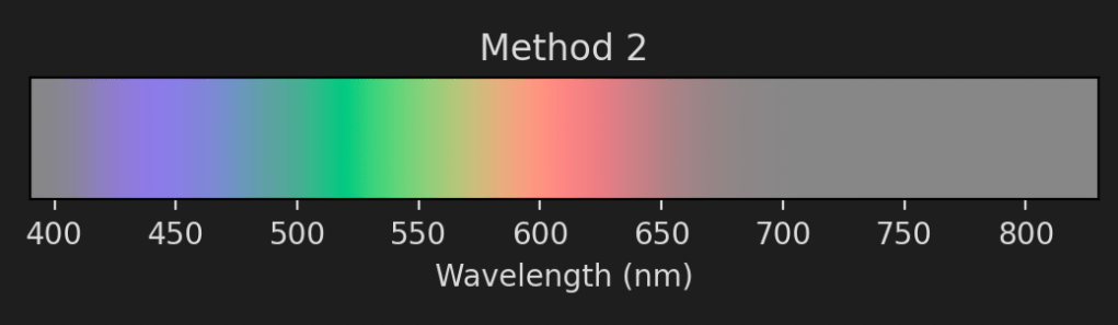
This spectrum looks much smoother but is also more washed out. For the next blog posts this won’t matter too much since I’m not going to be displaying a lot of monochromatic light. We’ll therefore sit comfortably within the range of colours that screens can display.
It can also be interesting to look at what these spectra look like if we convert them back into XYZ space. Here they are:

As you can see both methods convert the original points such that they now sit inside the colour triangle. Method 2 touches the triangle in one spot, which corresponds to its minimum RGB value being 0.
And that’s it for the main quest! We now have everything we need to proceed in determining the colour of the sky. However, I do want to take a quick detour to talk about why using exactly three primary colours is perfect and how this all relates to what’s going on in our eyes.
Rods and cones
As someone who never did any more biology than necessary I’m not going to pretend to understand the intricacies of sight. However, the process boils down to light hitting photosensitive cells on our retinas, causing a signal to propagate to the brain. The brain then combines these signals to form an image. There are two types of light sensors in our eyes: rods and cones. Rods are far more sensitive than cones and so they tend to be used particularly in low-light conditions. However, while different wavelengths excite the rods by a different amount, there is no way for the brain to distinguish between a bright light at one wavelength vs a dimmer one from another wavelength3. That’s where cones enter the picture. They come in three types: short, medium and long. Depending on the incoming power spectrum they will each get excited a different amount, and it’s the combination of the three that the brain uses to create colour.
In other words, our eyes do not actually measure the power spectrum directly but projects it onto three dimensions which we interpret as colour.
This webpage tabulates cone sensitivity spectra, also known as cone fundamentals. The website has a few different options for models and formats. Below you can see the linear normalised sensitivity spectra for each type of cone based on the 2-degree model from Stiles & Burch.

With these spectra we can easily determine the level of signal in each cone based on an incoming spectrum P. For a sensitivity spectrum S, the level of excitation e is

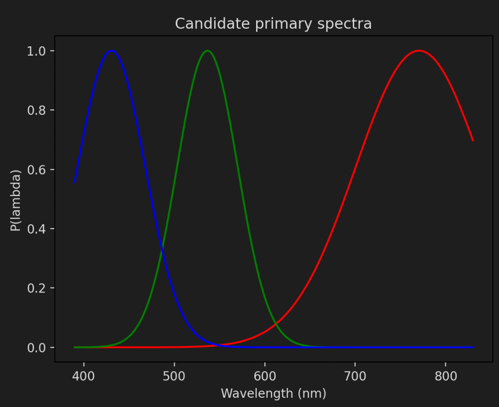
If we want to create sRGB values from these cone fundamentals we will need to know the power spectrum of the primaries. Unfortunately, no such thing exists, since the standard is defined in terms of xy values4. However, all hope is not lost. If we can find a power spectrum that gives the same xy value as the primary we can use this. Given that there are an infinite number of spectra that will produce the same xy values that shouldn’t be too hard. Let’s parameterise a simple model based on a normal distribution:

We can then calculate the XYZ value of this spectrum by using the colour matching functions (See the three consecutive equations for R, G and B above). By varying lambda_0 and sigma we can minimise the distance between the XYZ values we get and the desired one for each primary. For the sRGB primaries these are the results I get:
Desired xy: [0.64 0.33]. Actual xy: [0.654 0.345]
lambda_0 = 770.49, sigma=70.13
Desired xy: [0.3 0.6]. Actual xy: [0.300 0.600]
lambda_0 = 536.63, sigma=33.61
Desired xy: [0.15 0.06]. Actual xy: [0.140 0.060]
lambda_0 = 430.63, sigma=37.56
And here is what the spectra look like:
We will also need to figure out the relative scale between these. We can do this with the whitepoint. It should be no surprise that we require the exact same data to pin down the sRGB values as before. There is no such thing as free lunch! We need to match the XYZ value of the whitepoint by scaling the unscaled XYZ values of each primary.

We can rewrite the RHS as a matrix multiplication, which is easily solvable using np.linalg.solve or similar.

With the primaries in hand we can determine sRGB values for any spectrum. First, let’s define the LMS colour space to be a vector indicating the excitement of each cone type. This is analogous to the XYZ or CIE RGB spaces, with the cone fundamentals acting as colour matching functions. We will parameterise the relationship between LMS space and sRGB with a matrix A:

We can then use each primary (P_r, P_g, P_b) to solve for A. Here is the equation for P_r:

The RHS simply evaluates to the first column of A, so the equation ends up very easy to solve. By performing the integrals for P_g and P_b we get the second and third columns as well.
As a proof of principle let’s now use A to generate the sRGB for the colour spectrum we did above. All we have to do is to invert A and left-multiply it with the cone fundamentals. Here they are:
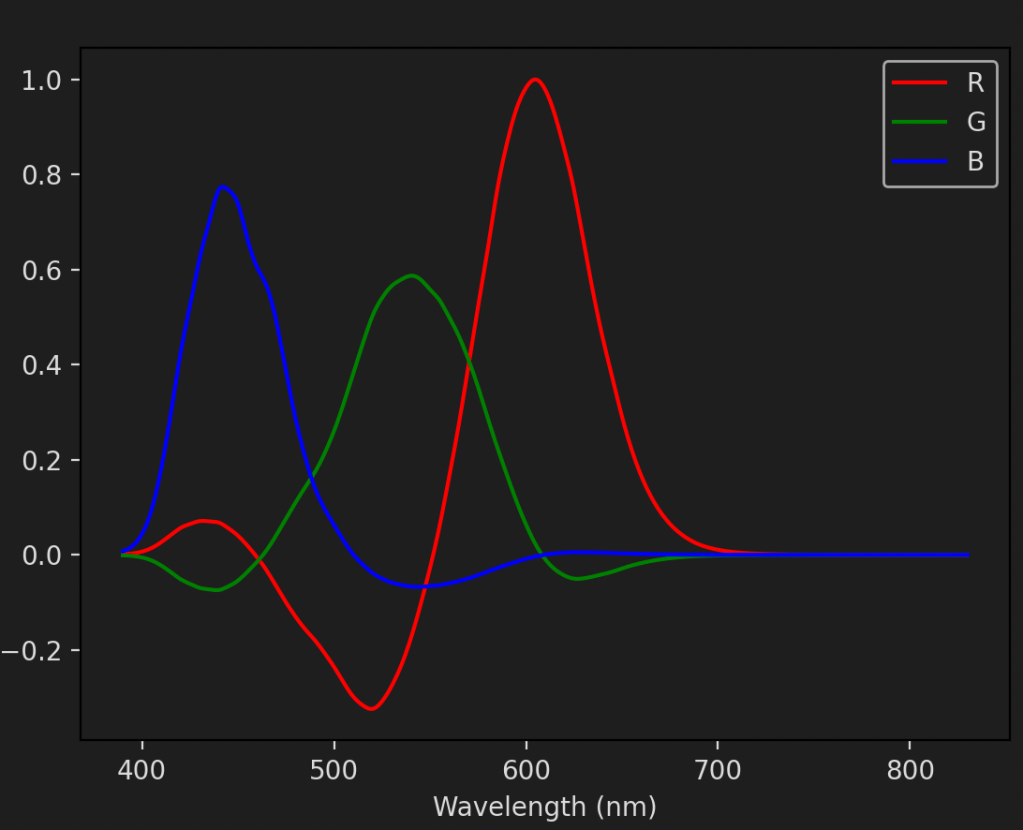
It is the same plot as the one we saw earlier! But instead of arriving at it directly through colour matching functions we used the cone fundamentals and the5 power spectra of the primary colours. Of course, we still had to use the colour matching functions but only because that’s the space in which sRGB is defined. In a more modern standard, Rec. 2020, the primaries are actually defined in terms of pure wavelengths and so we could skip the XYZ space entirely.
Why 3?
Knowing that there are three types of cone cells, it’s not too surprising to learn that all of these colour spaces also have three components (RGB, XYZ, LMS, LAB, etc.) This is of course no coincidence. It is possible to define a colour space with more or fewer primaries but you quickly run into trouble. With just two primaries you can only represent a very limited number of colours. Just one plane in XYZ space. Discounting luminosity, just one line in the xy space. With more than three primaries you end up with a non-unique representation of colours. This is of course possible (See the CMYK space for example6) but it leads to mathematical difficulties when converting back and forth. All of our matrices become non-square, so don’t have inverses.
This non-uniqueness can also be understood more intuitively without considering the linear algebra. With four primaries the gamut of the space becomes the interior of the quadrilateral formed by the four corners. If you pick any three corners to form a triangle, then do it again with another three corners, it’s easy to see that the two triangles must have interior points in common. That means that there are colours which can be formed by a combination of three colours in two different ways.
100 years later
It is fascinating that something as fundamental as computer graphics is still based on sensory experiments from almost 100 years ago. Although the colour matching functions have been refined throughout the years, it is incredible that something as seemingly subjective as the perception of colour can prove to be so enduring, and match so well to physical measurements of cone cells. There are no Guild equations as far as I’m aware but his and his colleagues’ work have certainly had a huge impact. We are indeed standing on the shoulders of giants.
- Fun fact: D65 actually matches the spectrum of a 6504 K black-body, since the value of Planck’s constant has been updated since the introduction of D65. ↩︎
- See the CIELAB and CIELUV spaces, as well as this great post from Björn Ottosson. ↩︎
- As I’m writing this I wonder if our brain uses the signal from both rods and cones to infer colour. From what I’ve read rods tend to be ignored in the discussion of colour but I don’t see why. Perhaps it has something to do with the different absolute sensitivities of the two types of cells ¯\_(ツ)_/¯ ↩︎
- It makes a lot of sense for the standard to specify its primaries in terms of xy values instead of prescribing a specific power spectrum. Different devices will be able to produce different power spectra that correspond to the same xy values. The xy definition gives them better flexibility in implementation, without causing the primaries to look any differently to the human eye. ↩︎
- Or rather, one possible power spectrum of each primary. ↩︎
- The CMYK space is not an additive colour space but a subtractive one. That means the equations for how spectra relate to the colour space change slightly. However, it is still a 4-dimensional colour space ↩︎


![\int_{a-b}^{a} \ln(x) dx \left[ x\ln{x} - x \right]_{a-b}^a](https://s0.wp.com/latex.php?latex=%5Cint_%7Ba-b%7D%5E%7Ba%7D+%5Cln%28x%29+dx+%5Cleft%5B+x%5Cln%7Bx%7D+-+x+%5Cright%5D_%7Ba-b%7D%5Ea+&bg=1e1e1e&fg=dbdbdb&s=3&c=20201002)


